Best Practices for UI and UX Designers
Design Consistency Guide
Design consistency ties UI elements together with predictable and distinguishable actions for a great product experience. When the designs are consistent, customers become regular users and more acquainted, and they begin to trust the product more.
Here are five best practices to provide users with a consistent UI
- User-focused UI and UX design research
- Establish design patterns for product UI and UX design consistency
- Consistent actions in the application
- Product Content
- Consistent communication
1. User-focused UI and UX design research
Quality research is more important for a consistent experience. It should neither be underestimated, hurried, nor overlooked in the beginning stages of product planning. Keep your users on top of mind by defining goals. Get into the mindset of a new user and be mindfully aware of what they want to accomplish and how will the application help them.
Familiarize yourself with common UI patterns so that you can filter and modify them based on specific user goals. Though most people still look for common placements of certain elements (such as looking for the search bar in the right or upper center), the patterns continue to evolve.
Designing without research is like getting into a taxi and just saying,-Drive.
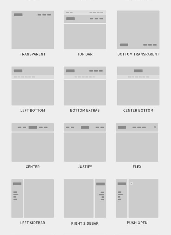
Common UI Design Patterns
Breadcrumbs
Provides secondary navigation by using linked labels to show the path in the hierarchy from the front to the current site page.
Lazy Registration
Use sign-up pattern instead of forms that put users off registration. This lets users familiarize and sample what your site/app offers for. Then, you show them a sign-up form.
Note:
- User-focused UI and UX design research
- Establish design patterns for product UI and UX design consistency
- Consistent actions in the application
- Product Content
- Consistent communication
Forgiving Format
Allows users to enter data in various formats (e.g., street/city/town/village or zip code).
Clear Primary Actions
Make action buttons stand out with color for users to know what to do (e.g., “Submit”).
Progressive Disclosure
Show users only the features that are relevant to the task, one per screen. You’ll reduce cognitive load if you break input demands into sections (e.g., “Show More”).
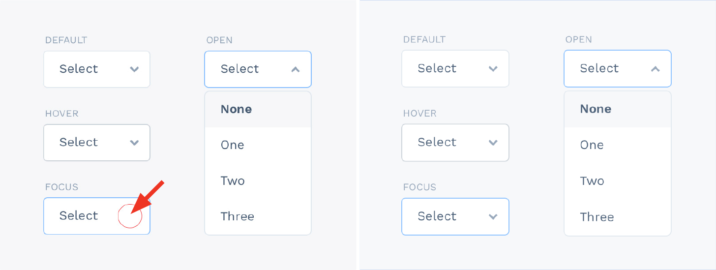
Hover Controls
Let users find relevant information more easily by hiding non-essential information on detailed pages.
Steps Left
Shows the number of steps a user needs to take to complete a task.
Subscription Plans
Offer users an options menu for joining at certain rates (including “Sign-up” buttons).
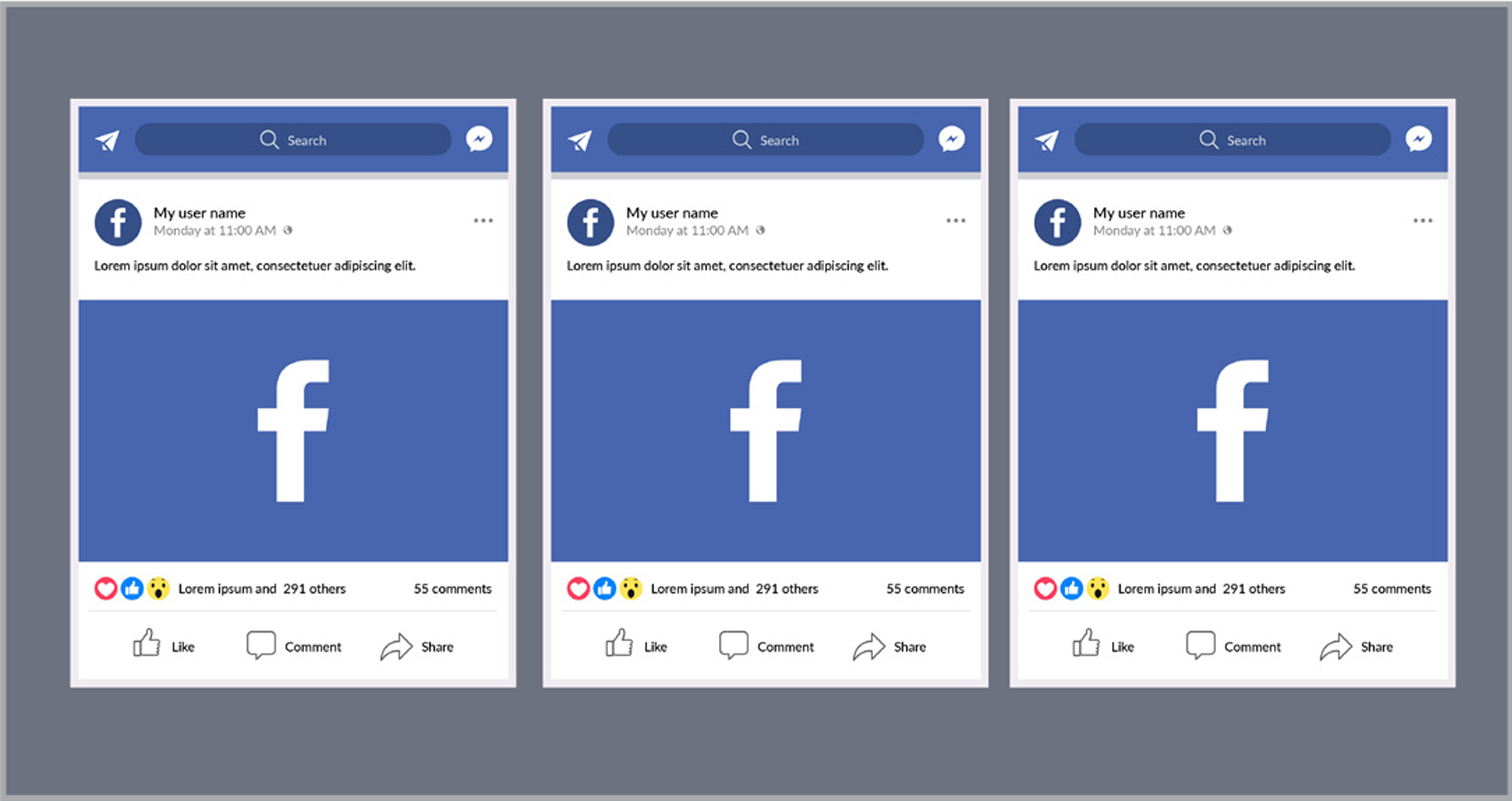
Leaderboard
Use this social media pattern to boost engagement.
2. Establish design patterns for product UI and UX design consistency
The user performing tasks with a minimum number of actions is the major key to a consistent and successful UI and it should always be modified for the effective flow of the shorter task.
Common UI Design Patterns
An established design hierarchy along with design patterns does wonders for UI consistency.
Users subconsciously pay attention to the order of the elements they interact with. Some elements take precedence over others when it comes to visuals and the human eye depending on how “noticeable” they are some elements with bigger sizes, bright colors, etc, take precedence over others. UX designers must think in terms of what people are most likely to see first, second, third, and so on and ensure to find primary functions faster than others.
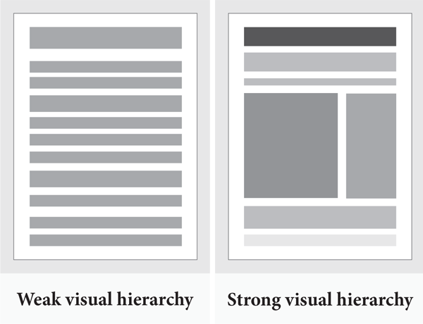
UI and UX Design elements
UX designers must properly prioritize all elements without anything slipping through the cracks on the screen such as buttons, forms, lists, panels, cards, etc. You can try using templates if you’re having difficulty standardizing your app or site.
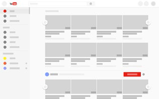
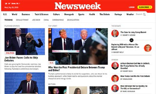
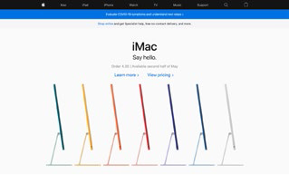
12 Common Web Design Patterns
| 1. Cards |
|
|---|---|
| 2. Grids |
|
| 3. Magazine |
|
| 4. cust-mini-container-free |
|
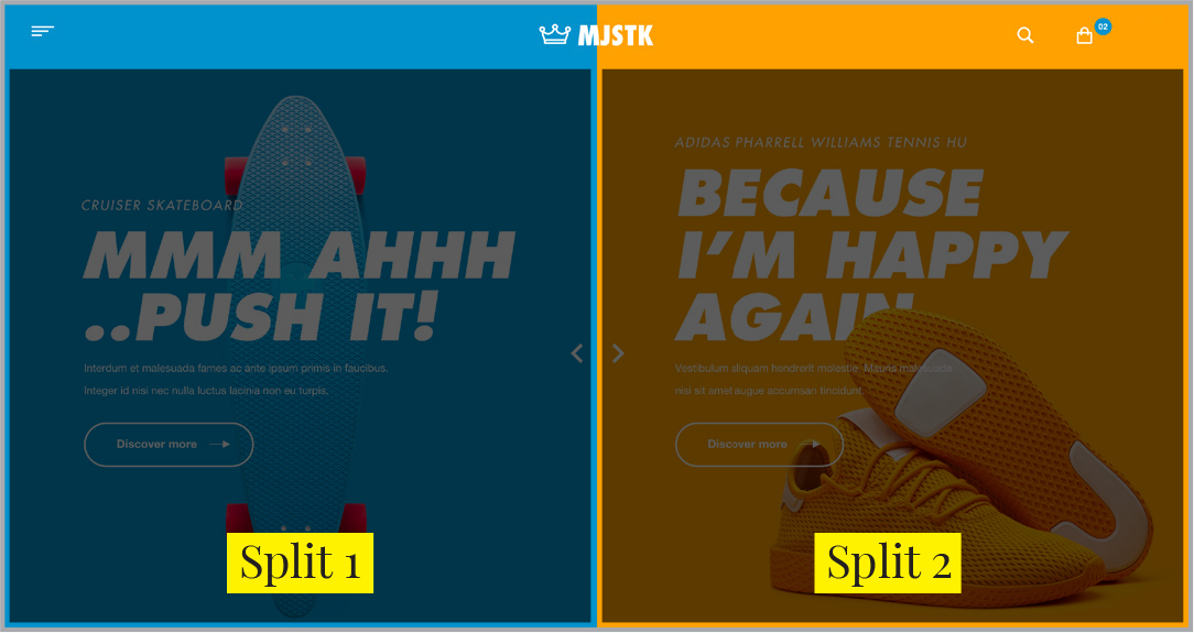
| 5. Split Screen |
|
| 6. Single-page Web Apps |
|
| 7. F Pattern |

|
| 8. Z Pattern |

|
| 9. Horizontal Symmetry |
|
| 10. Approximate Horizontal Symmetry |
|
| 11. Vertical Symmetry |
|
| 12. Asymmetry |
|
Branding elements
Visual elements are the first thing that people usually see. They communicate the brand values and purpose and make the brand stand out with a unique style. It’s well set-up and pleasing to the eye and makes the brand easily recognizable. It should be consistent across all products and channels.
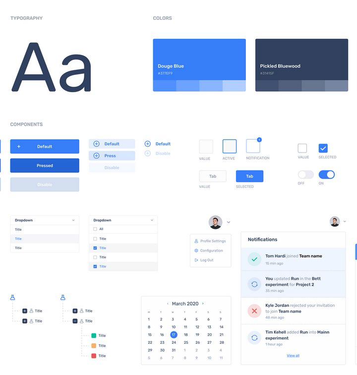
Style guides usually provide all these information
List of Brand Elements
Logo
|
Brand Name
|
Color
|
Slogan
|
Image
|
Shape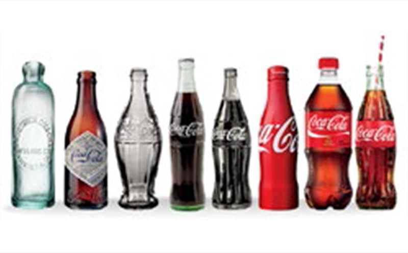
|
Graphics
|
Typography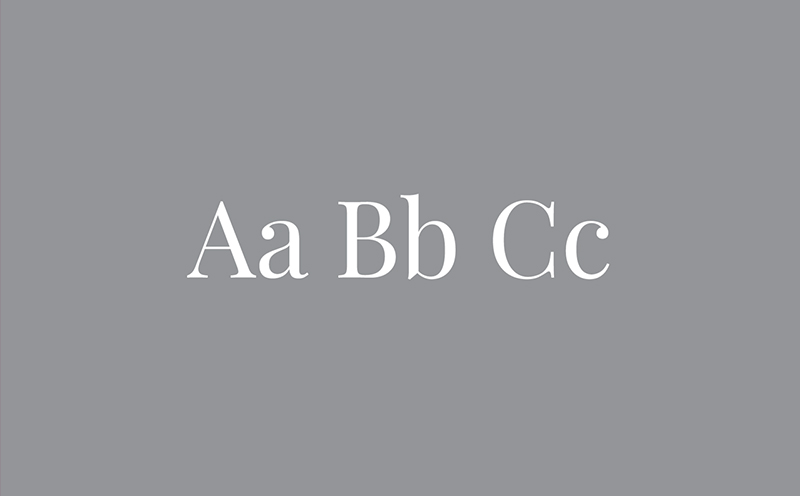
|
Typography
Typography should mesh well with the other elements of your brand, because they associate with a specific feeling that must match your brand’s personality.
Ensure that the selected font is used on every piece of material your brand produces.
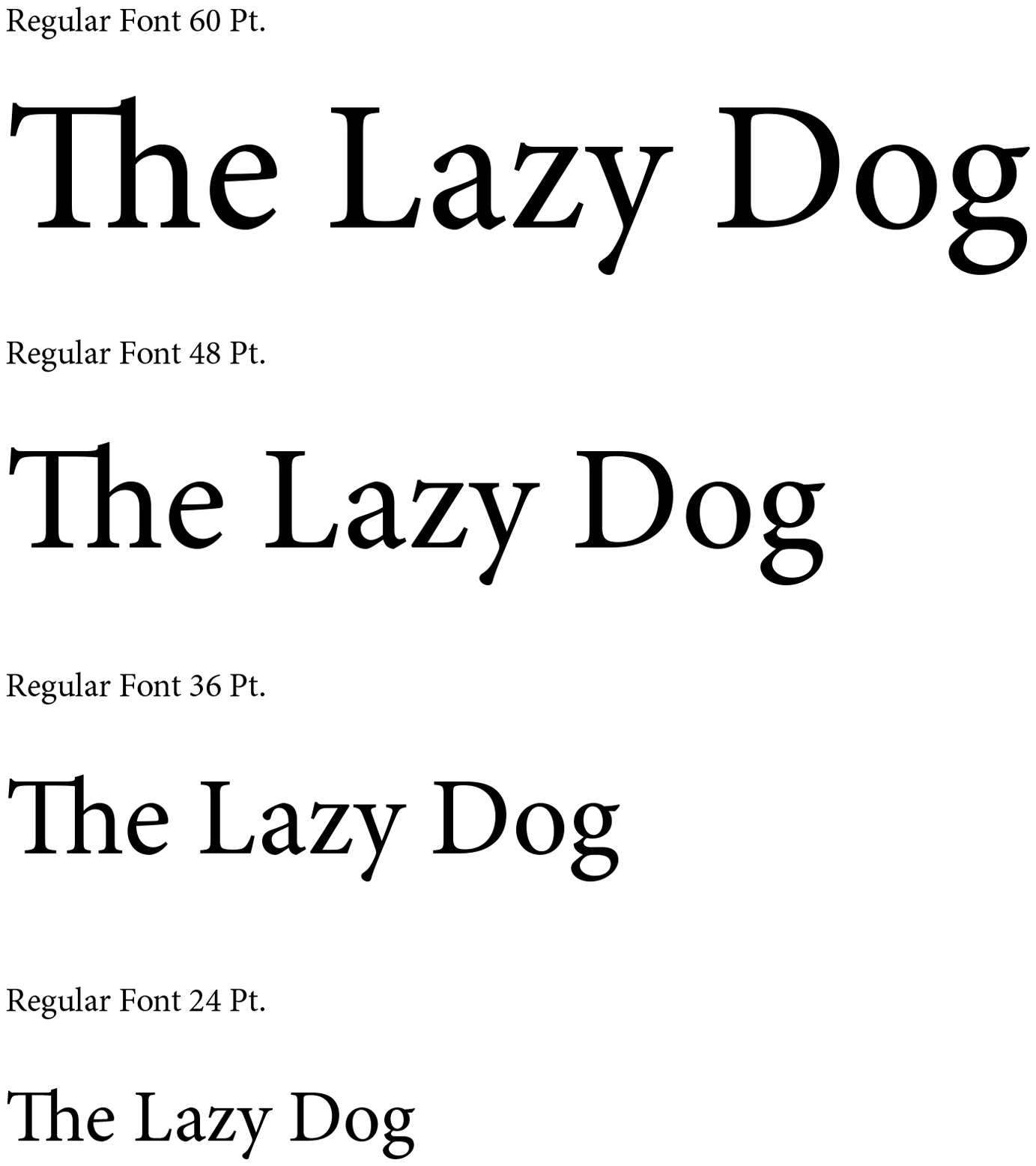
Minion Pro.
Primary Typeface:
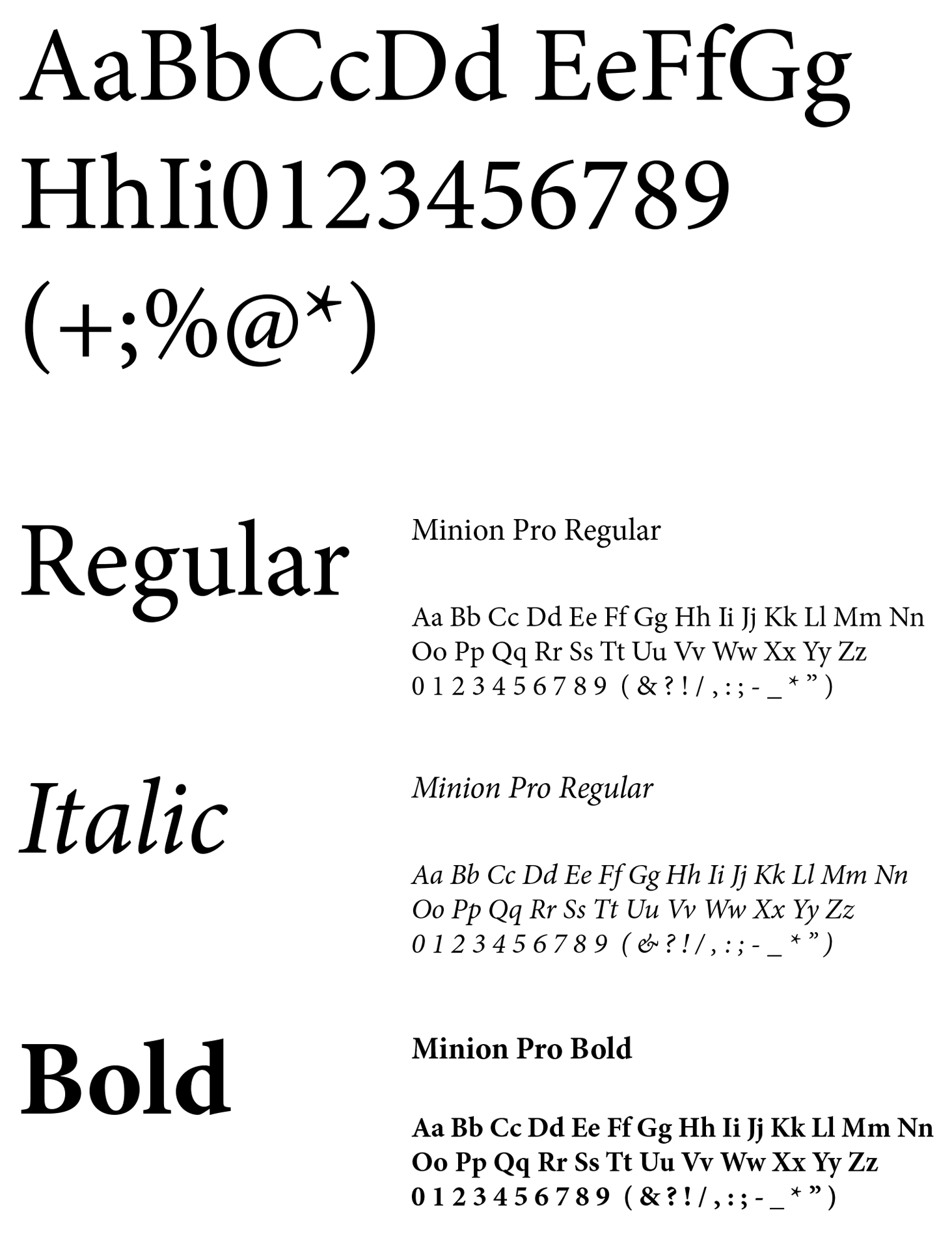
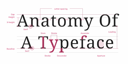
Anatomy of Minion Pro:
Typeface Weights:
Components
Know how each component behaves so that the UI patterns and their components properly prioritize all elements on the screen without anything slipping through the cracks.
The components are:
Buttons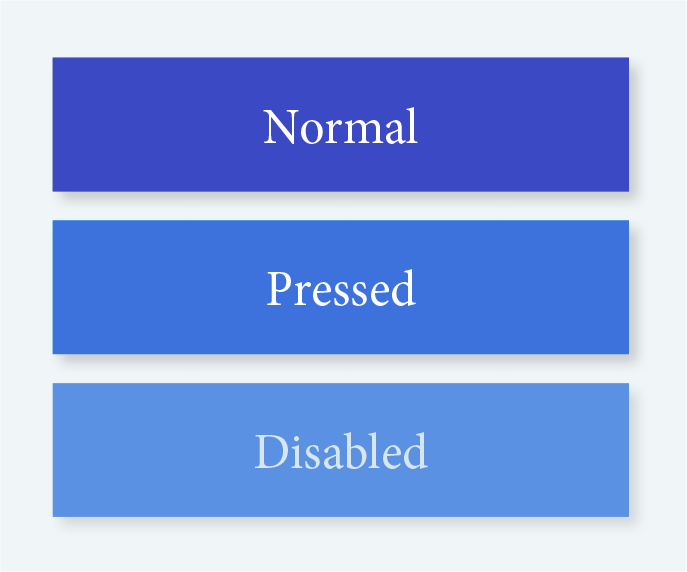
|
Cards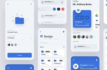
|
Forms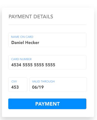
|
Lists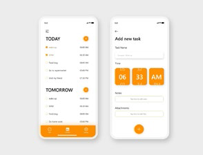
|
Panels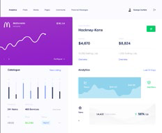
|
Progress Bars
|
Templates
If you’re having difficulty standardizing your site or app, try using templates because the layout and elements look the same. Most applications allow them and they streamline UI features across the products.
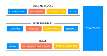
Pattern library and design system
Pattern library and design system is one of the keys to consistency as it keeps everyone on the same page as a point of reference though it may not be user-facing.
They are the rulebooks that can be referred by anyone on the team at any time.
They are essential for team-wide consistency.
A design system has more information about various components and helpful documentation about all the UI patterns.
The Rulebook
The Design System
3.Consistent actions in the application
An easy-to-use application saves time and helps users accomplish their goals by eliminating multiple actions and confusions making their task flow run more smoothly.
As users explore new parts of the application, they inherently transfer past knowledge to new contexts. Consistent actions become a habit by nature and, the user can eventually use the application without even thinking.
The few things you should consider when designing your interface are if all parts of the application behave the same way? Are interactions predictable and consistent? And how much time is a user going to spend to understand this interaction?
4. Product Content
Visual elements are not the only ones that attract, but also the content throughout the application. Consistent terminology and copy in each place in the application is another key to avoid confusion.
Brand consistency in content plays a crucial role in UI elements. Pay attention to the content structure in the areas like navigation, form fields, tooltips, dropdowns, image captions, validation messages, loading screens, confirmation pages, etc.
Set appropriate user defaults to reduce the burden on the user by considering user goals upfront
Content structure
Content structure aims at organizing content for the users to find everything they need without big effort and easily adjust to the functionality of the product. This way you can ensure a sufficient user experience by forming a skeleton of a layout. Content structure guarantees a high-quality product as it reduces the possibility of navigation problems. They go hand in hand to create a clear navigation system and user-friendly product.
The content handled in these areas needs attention:
- Navigation
- Dropdowns
- Form fields
- Validation messages
- Tooltips
- Charts
- Image captions
- Error messages
- Loading screens
- Confirmation pages
- Product support documentation
Brand consistency in content
A certain part of the application might feel off when there is an inconsistency in the content’s language.
Other writing guidelines also influence the user’s experience such as title case and voice/tone as they are a little harder to pin down. A casual style shouldn’t clash with formal “brand language.”
Consistency can help to solidify brand recognition as your target audience is being exposed to visual branding core messages and other brand elements repeatedly.
Brand is just a perception, and perception will match reality over time.-Elon Musk
Appropriate user defaults
You can set realistic defaults by considering user goals upfront to reduce the burden on the user.
The user may not have to make any adjustments if the defaults are set to the popular preferences or the most likely choice according to past statistics.
5. Consistent communication
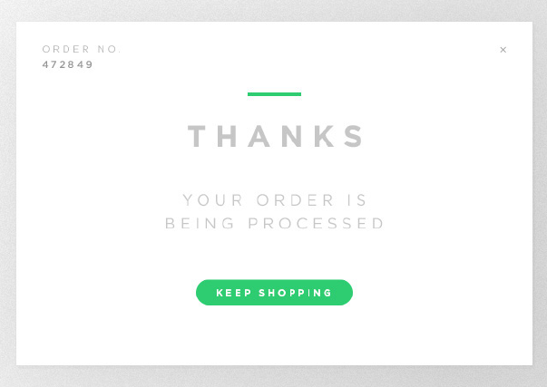
Every interaction with your user is communication! Such as search results, error windows, form submit messages, etc. And the way you communicate should be consistent keeping the user up to date and informed on what’s happening.

Changes in state and helpful information
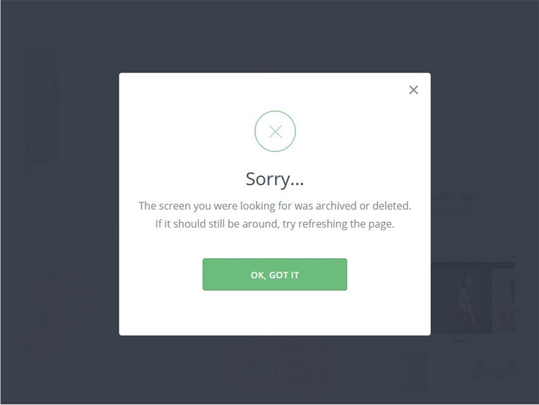
Users appreciate feedback and quick confirmation of whether an action took place or not. When a user is not clear what to do next, it causes them frustration as some actions are not so self-explanatory. Instructional texts of a line or two can solve the problem.
Error messages are useful as well. Users need to know what happened though they may not like seeing it so that they can correct it
The end goal is a perfectly consistent and in-sync interface
A brand is simply trust- Steve Jobs


